Showing posts with label AoP Assignment 1. Show all posts

Tutor Feedback & Key Learnings

I recieved feedback from my tutor on Assignment 1, and it was broadly in line with my own self-assessment, which is a good start. The summary of the key learnings, placed in my order of importance, are:
  1. Make sure I stick strictly to the assignment. Assignment 1 is all about visual differences between images, but I included some pairs of images where the differences were not visual but were more ambiguous. Partly I think this was because I had been reading The Photograph by Graham Clarke and had tried to impart some deeper meaning to some of the images.(see here). Anyway, I have Assignment 2 printed out and pinned above my desk now as a constant reminder!
  2. Try not to mix different styles (i.e. black and white and colour) in one piece, try to keep a theme/narrative going throughout the piece.
  3. Be careful before using a form of manipulation - especially HDR as this can look 'contrived', and was not really suitable for this assignment.
  4. Bring in more references to research and particularly other photographers' work into this blog.
  5. I presented the images and notes in a photobook, and whilst this is good method of presentation it makes re-shooting and re-editing, following your tutors feedback, costly and time-consuming. Better perhaps to use a more flexible format, but possibly then consider a photobook for formal assessment.
  6. Pre-visualising often helps to foster other ideas when shooting.
  7. Be careful to not to have images that are too similar - I included two images of logs where one is simply a closer crop of the other - in hindsight this was perhaps a little lazy.
  8. Don't worry too much about equipment - smartphone images can work well.
  9. Be realistic about deadlines and allow time for editing.
References

Clarke, G. 1997. The photograph. Oxford: Oxford University Press.

Key Learning - Assignment 1

One of my key learnings from the first assignment in 'Art or Photography' is how pre-visualising and sketching images before the 'execution' - the act of actually capturing the photograph - is that often this preparation leads to quite unexpected results which are often better than the pre-visualisation. Here's two examples:

This idea for 'curves':

Became:
Curves
This idea for 'lines':

Became:
Lines
I am not quite sure what's happening here, but it's not the first time this has happened to me. One theory is that by having sketched out some ideas, subconsciously I can relax and in so doing become more receptive to other ideas - both the images above were obvious but I never noticed them until I tried to capture the ideas I had sketched out.

It's a bit like when you try to remember something but no matter how hard you try, you cannot. Then, later, when you are thinking about something completely different, the thing you were trying to remember just pops into your head.

Contrasts - Part 5

I learnt from reading Michael Freemans' book The Photographers Eye that the 'Contrasts' task is nothing new, as it actually dates back to Bauhaus circa 1920. There it was a task set by Johannes Itten, the Swiss expressionist painter, as part of the 'Basic Course'.

References

Freeman, M. 2007. The Photographers Eye. Lewes: Ilex.

Wikipedia. 2014. Bauhaus. [online] Available at: http://en.wikipedia.org/wiki/Bauhaus [Accessed: 18 Feb 2014].

Wikipedia. 2014. Johannes Itten. [online] Available at: http://en.wikipedia.org/wiki/Johannes_Itten [Accessed: 19 Feb 2014].

Curves and Lines

Getting close to the deadline for the 'Contrasts' assignment, so been thinking of things that I can shoot as close to home as possible. On the theme of straight lines and curves, came up with these sketchs of ideas:

Curves of rope loops
Coil of rope
Patterns of straight lines on decking

Contrasts - Part 4

Here's some shots from Birmingham, where I had travelled to try and capture some contrasting views of the developed and undeveloped parts of the city.

Sign of the times 1

With this picture, and the one below, I was hoping to show the contrast between the run-down and re-developed parts of the city. I like the fact that both have signs that promise so much - one making promises that clearly cannot be delivered on any more, and the other make a promise that is, well, superficiously enticing.....

Sign of the times 2

Shot as a pair with Sign of the times 1, I can't help feeling the sign's 'promise' is a little surreal, hence the unrealistic HDR processing of the image. Both sites face each other across open land.

New vs Old - Birmingham Library & Hall of Memory

East Side Park & Millenium Point

Above was another idea to contrast the developed and un-developed parts of the city. I applied a little HDR in Photoshop - I wanted this to look a bit like an artists impression or one of those scale models made to show what the development would look like. This site is between the Eagle and Tun and The Hive (first two images).

Who is Ezno? Or is it Enzo?

Another shot whilst exploring Birmingham - not particularly on-topic of contrasts, but I just liked the possibility of a mis-spelt name, and as the person came along I included them for a sense of scale.

All of the images in this shoot were taken with a Nokia Lumia 1020 smartphone, see my review here.

Contrasts - Part 3

Whilst looking for 'contrasts', I hit on the idea of an old book versus an electronic book, but when I went to work on this, I hit an unexpected secondary contrast.

I retrieved my wife's 2011-model Kindle from a drawer where it has been left unused for several months, having been replace by a new tablet, only to find it's battery was so drained no amount of charging could revive it. It will almost certainly get recycled rather than repaired.

Dead Kindle

This model Kindle has been superseded, I think, at least three-times in the model range, and itself was the fourth generation since the original launch in 2008! So the contrast is not just between 'old' and 'new' but is also, and more poignantly, between 'longevity' and 'transitory'.

130-year old book of poetry by Elisabeth Barrett-Browning

Perhaps, more importantly, the book remains a desirable object, worthy of being loved and cherished as an object in it's own right, where as the modern equivalent quickly fades to something with little or no value at all, and therefore soon becomes unwanted and unloved.

Contrasts - Part 2

Now I really begin to see the pitfalls in the what I've set out to achieve, because as well as the expected photographic issues of shooting smallish objects up close (shallow depth of field and obtaining accurate focus), there also the very annoying issue of every spec of dust, pet hair, grit etc., literally looming large in every image. Unfortunately there's nothing for it but to keep the blower-brush to hand and to be vigilant, both during shooting and later in Photoshop.

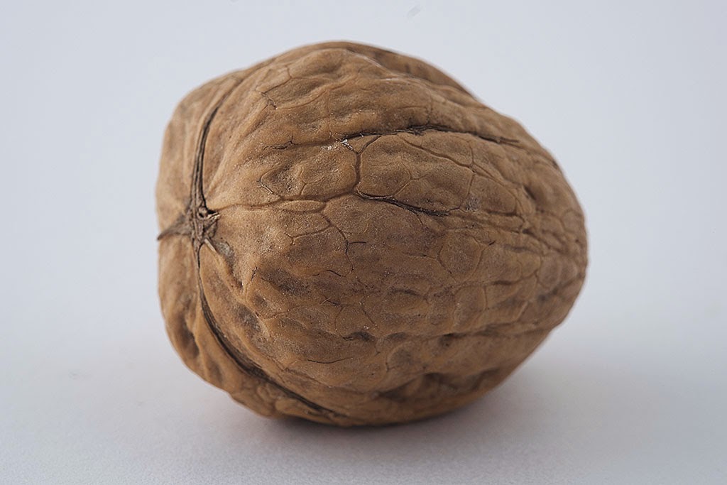
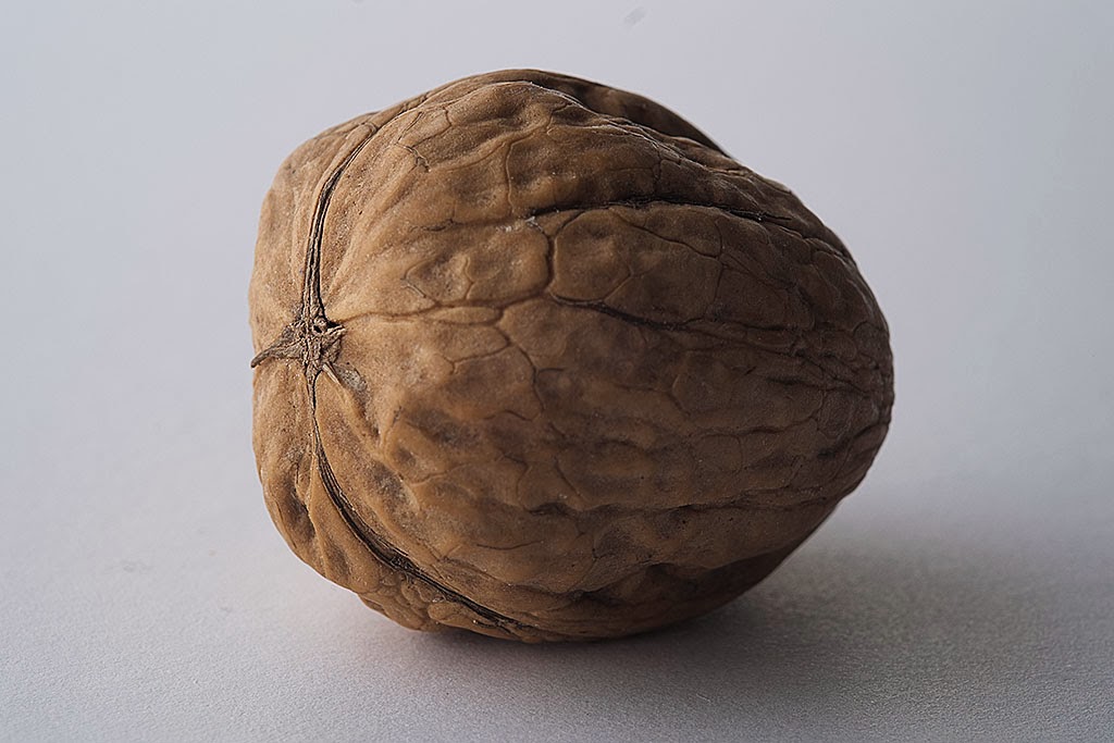
Here's the affect of the black card as mentioned in Part 1:

Without

With

Contrasts - Part 1

My first assignment is all about contrasts, so I thought a good start would be to gather some small objects to demonstrate contrasts in their physical characteristics.

This leant itself to indoor table-top shooting, which, given the weather we'd been having, was a sensible way to get started and keep momentum. I dug out an old Lastolite light 'tent', which I bought years ago for snapping objects to sell on ebay.

This is designed to be used with a single light source and is made of white diffusing material, except for one side panel which is silver. This silver panel reflects light back onto the unlit side of an object in order to 'fill' the shadow. I bought some coloured paper and card to fashion backgrounds, and to help control the lighting and shadows.

© Tim Tucker 2014
Sketch of lighting set-up

The basic idea was to use soft diffuse light for showing off softer, smoother objects and make a much more harsh, directional light to show up texture in other objects. Lighting itself would come from a very old and very battered Bowens studio flash unit.